In recent years we have posted very strong growth. Our expansion processes have increased significantly too. In order to reflect this trend, we have decided to undertake a complete relaunch of our entire market presence. Our aim is to be even more responsive to our customers’ needs in the coming years and to provide them with optimal service quality.
A new external appearance and communication
Together with a trusted advertising agency we have worked out the key elements of our new appearance in a positioning workshop.
The basis of our reflections was naturally the (new) positioning of the company. This meant first working out the USP and then the associated steps required to ensure that this positioning also “works” externally.
So the most important task was to find a positioning that clearly sets us apart from our competitors.
SANUBE is • a customer-focused and cooperative solution provider • which reliably delivers new and innovative products • and satisfies individual customer requirements • with the “Made in Austria” seal of quality.
This relaunch will now take place rigorously but with great sensitivity. Not all at once, but with continuous steps aimed at achieving a uniform corporate design and corporate identity.
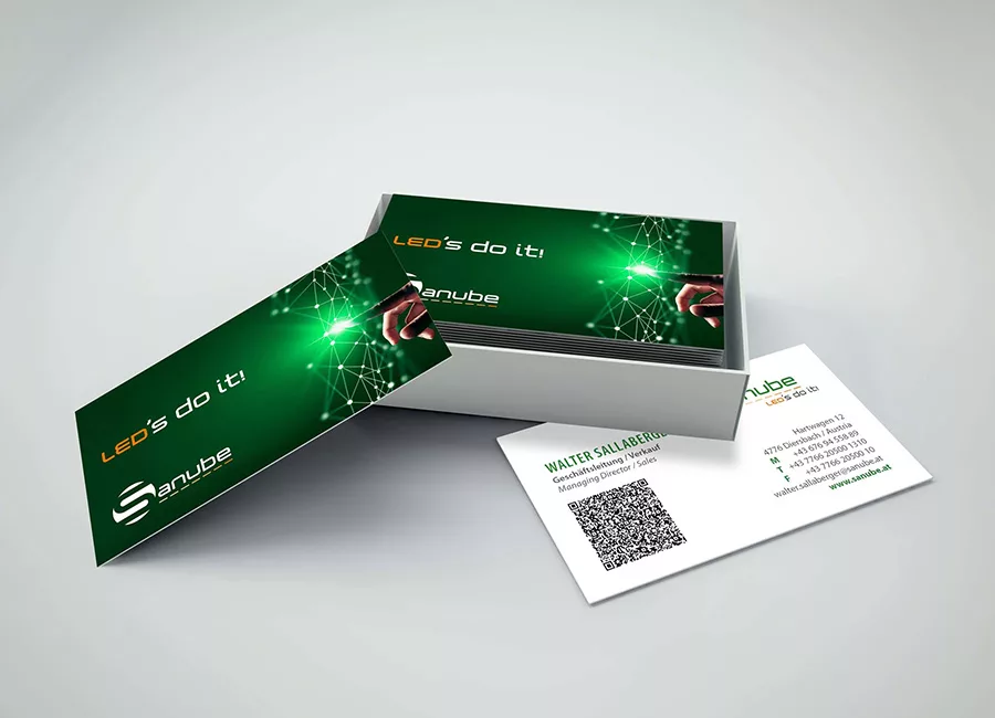
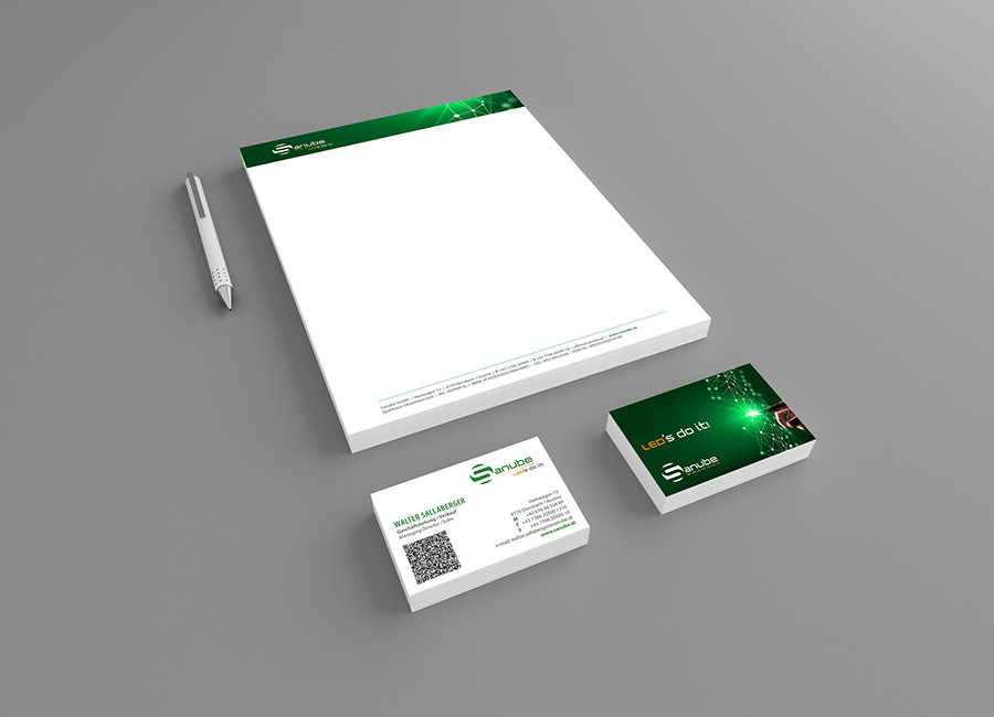
Our new logo: The “S” is incorporated without a margin in a dark-green circle and visible as a letter. The advertising agency has chosen a very original font for Sanube to ensure distinctiveness. Beneath is a light “LED bar” with a progression from light to dark orange. This underlines the word and at the same time provides a graphic representation of LED technology. The slogan “LED´S DO IT!” is written in capitals (as a contrast). This play on words was coloured dark orange to achieve a connection with the LED bar. We identify with our products and will continue to manufacture them with the utmost care. We regard quality as paramount!
Zum Ändern Ihrer Datenschutzeinstellung, z.B. Erteilung oder Widerruf von Einwilligungen, klicken Sie hier:
Settings